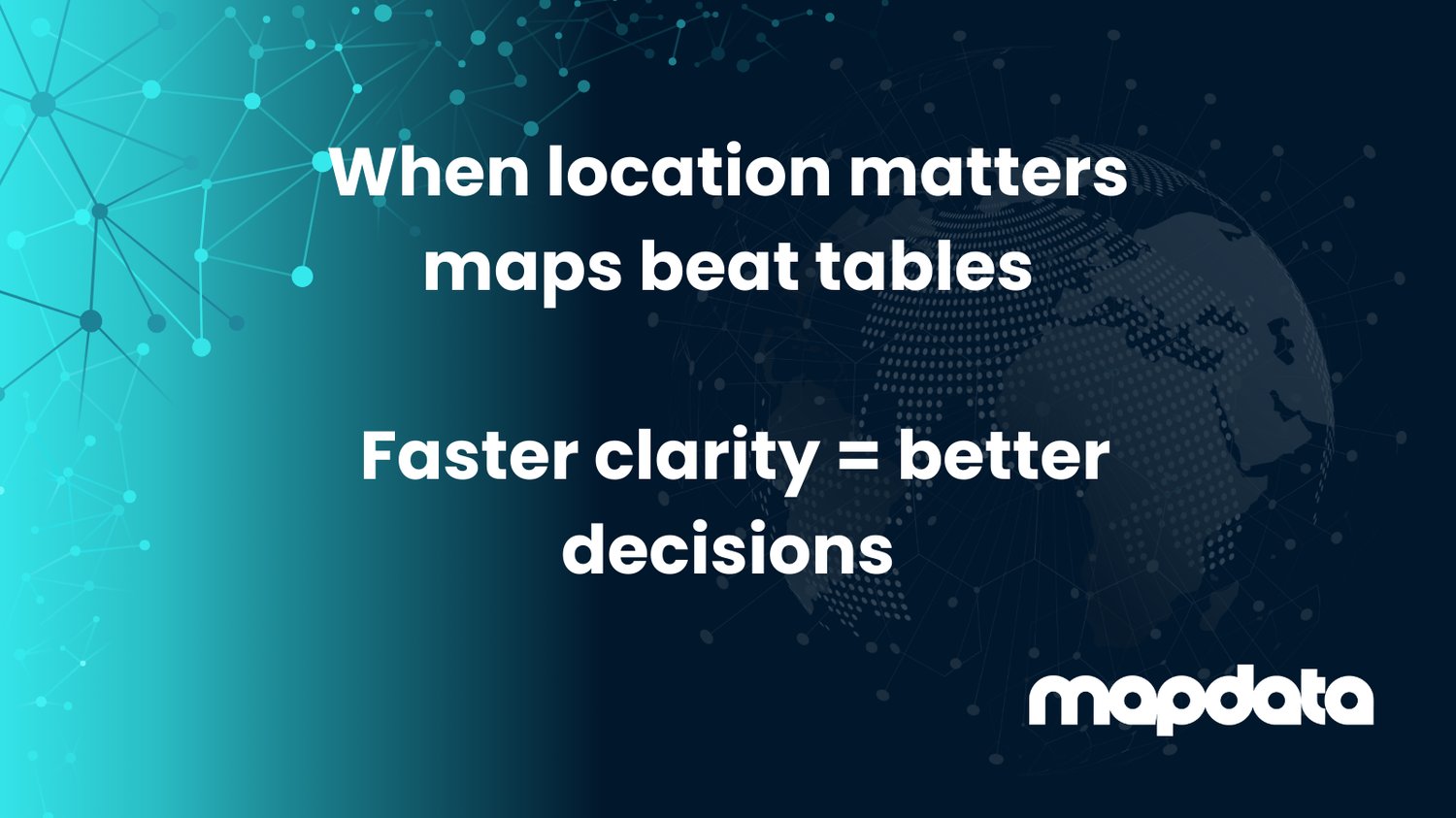
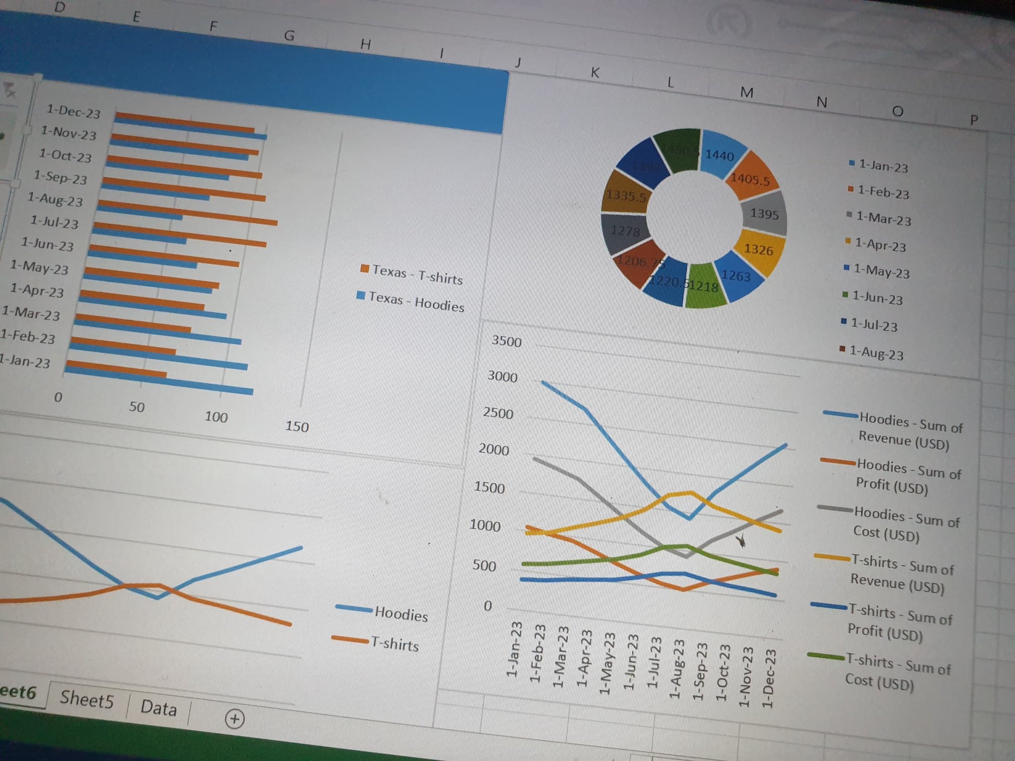
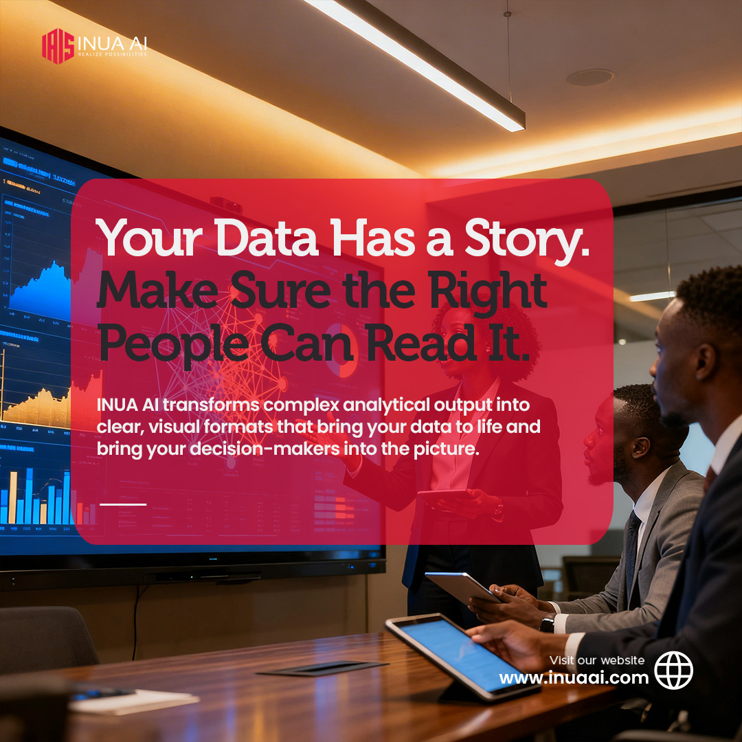
Data that cannot be understood cannot be used. INUA AI builds visualisations that make your data legible to the people who matter. #RealizePossibilities #INUAAI #DataVisualisation
🔗inuaai.com/content-and-da…4C
6
8-10 April 2026
From physalia-courses.orgGlasgow research challenges assumptions of a unified electorate A new data visualisation project from University of Glasgow is challenging conventional
From bobfm.co.uk