Pentawards
Pentawards @PENTAWARDS ·
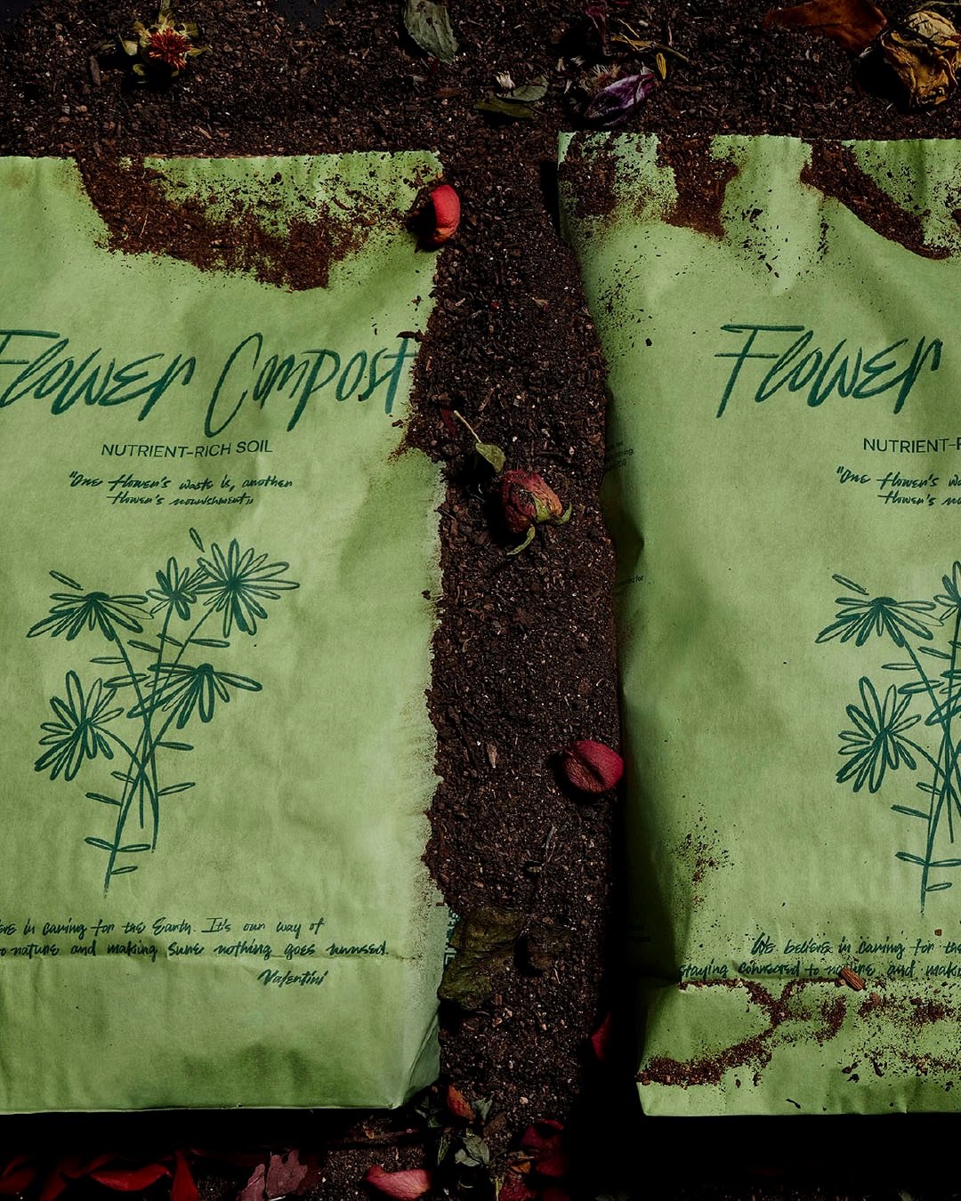
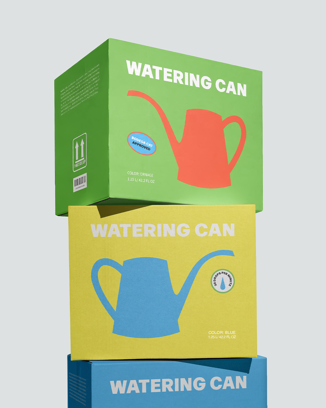
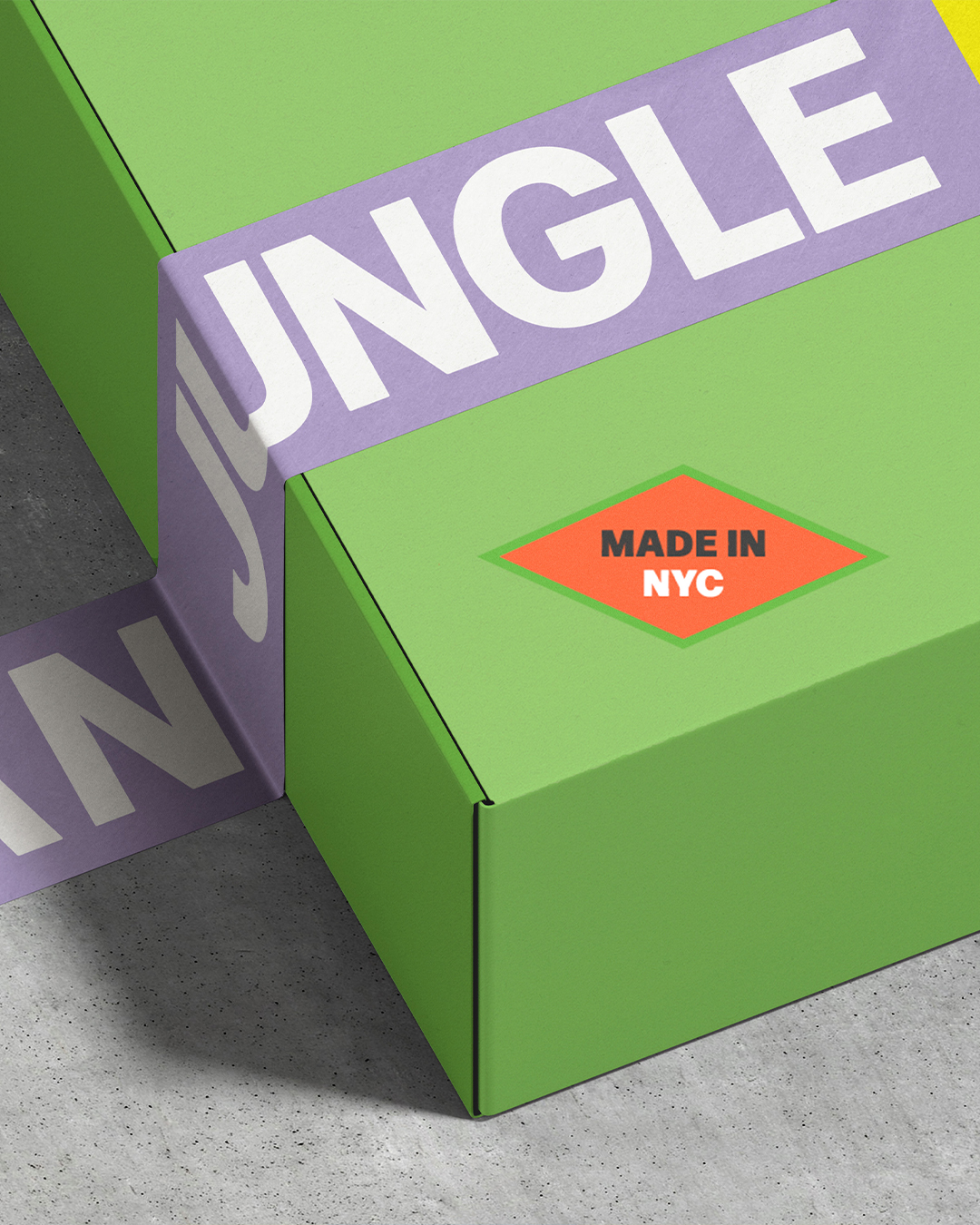
Milica Mila Ristic's #packagingdesign for Urban Jungle uses vibrant colour blocking and simple silhouettes to turn a functional watering can into a graphic, shelf-worthy object. The minimal typography and contrasting palettes give it a design-forward feel. #DailyDesignInspiration
4
186
Pentawards
Pentawards @PENTAWARDS ·
Base Design's #packagingdesign for Abel Fragrances is built on restraint - from a redrawn logotype to a bespoke faceted bottle. It incorporates 11% recycled, un-tinted glass, a home-compostable biotech cap, and 100% recycled paper. #DailyDesignInspiration
68
Pentawards
Pentawards @PENTAWARDS ·
nju:design's #packagingdesign for CRUNCH. In collaboration with graphic designer Federica Caputo, the agency crafted every detail - from the pocket-sized cardboard packs made from natural materials, to the joyful illustrations and copywriting for each one. #DailyDesignInspiration
89
Pentawards
Pentawards @PENTAWARDS ·
Cliche Studio's #packagingdesign for Soulmate bridges tradition and spontaneity, honouring Brazil’s heritage while speaking the language of a new generation. Its bold palette reflects this, turning the product into a statement of connection and freedom. #DailyDesignInspiration
103
Pentawards
Pentawards @PENTAWARDS ·
Module Roast's packaging design. Featuring clean typography and colour-blocked labels, the packaging feels both premium and functional. Made from 100% recyclable materials, it can be fully recycled at home. #DailyDesignInspiration
113
Pentawards
Pentawards @PENTAWARDS ·
SOUL's #packagingdesign for The Secret Garden. A floral line illustration evokes what once bloomed, whilst muted greens break from the dark, earthy tones typical of the category. Handwritten typography adds warmth, balanced by clean sans-serif clarity. #DailyDesignInspiration
100
Pentawards
Pentawards @PENTAWARDS ·
Lexie Logo's #packagingdesign for Naked Earth highlights a bold macaw illustration paired with line illustrations of cacao and botanicals, creating an earthy yet striking presence. Clean layouts and structure bring the entire packaging design together. #DailyDesignInspiration
1
142
Pentawards
Pentawards @PENTAWARDS ·
Boundless Brand Design's #packagingdesign for BEEMORE pairs bold colours with playful illustrations to express the brand’s “good mood energy” concept. The central eye-and-sun motif creates a striking focal point, blending mystical cues with a modern style. #DailyDesignInspiration
88
Pentawards
Pentawards @PENTAWARDS ·
design by martryna's #packagingdesign for Nana's puts the brand’s hero ingredient front and centre. Made from functional cardboard and finished in an unmistakable shade of yellow, the form mirrors the only thing that truly matters here - the banana itself. #DailyDesignInspiration
124
Pentawards
Pentawards @PENTAWARDS ·
Dispenser Studio's #packagingdesign for Ponte Reale transforms traditional Italian dairy into a bold, graphic statement. Geometric shapes and confident colour blocking create a playful yet distinctive visual language across the range. #DailyDesignInspiration
107
Pentawards
Pentawards @PENTAWARDS ·
Otero Torres' #packagingdesign for BENI was designed to reflect the colour, joy and indulgence of macarons. Bright, playful visuals highlight the product’s vibrant character, creating a distinctive identity that celebrates flavour and authenticity. #DailyDesignInspiration
103
Pentawards
Pentawards @PENTAWARDS ·
d origin's #packagingdesign for ORGN captures the fluid moment when nail polish flows between two integrated parts, with the section matching the product’s shade. The contrast between solid metal and glossy elements gives Melting its distinctive presence. #DailyDesignInspiration
1
137